You are using an out of date browser. It may not display this or other websites correctly.
You should upgrade or use an alternative browser.
You should upgrade or use an alternative browser.
Lakeview Cardroom
- Thread starter DrunkleWade
- Start date
- Replies: Replies 48
- Views: Views 555
LobsterWhat's that second font you've used there?
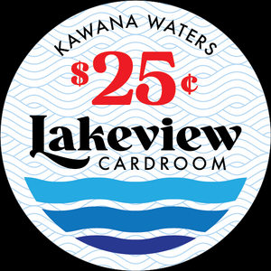
I like all three and I prefer the denom from the original on all three versions - too much matching seems to take away from the main word on the design. There are no real rules, you can use a "coordinating" font for the big L, without it being the same exact same font as the rest of the word. Either way works, just depending on your taste. In the 2 bottom versions, I personally would enlarge the L just a little bit more but that's just me, everyone's "eye" is different. One thing I did learn is to use the largest scale possible (without looking goofy) and pay attention to the small size print. This is because so many proofs look great but when put on the much smaller label, they shrink significantly. At least there is 1" to work with on the Scrowns.
Last edited:
I see what you mean by enlarging the L. It'll be one of these two I think.


Last edited:
You can't go wrong, I like them both with a preference for the second one. I don't know if you can (or want to do it) but I think bolder on the second one would make it stand out. I still like the denom style from the original, even on the second chip. Good job on these! In the end it's your baby, so go with what pleases YOU 
Last edited:
I've been looking for a font similar to The Lakeside Inn because I do like that one. I didn't have much luck but I did find this one. I kinda like it.


Last edited:
I feel like I'm interfering by offering so many comments and I hope you don't see it that way. I just dig inlay designs and I only offer suggestions from my opinion to see the design turn out to be the best it can be.
I love what you've done with this last iteration of the design. This one is bolder and has more "personality" and I love the way you've placed CARDROOM to complete the symmetry. At this stage, I usually narrow it down to maybe my 3 favorites and come back and look at them, or compare them side by side. Then come back and look at them again. One will grab you. I'll leave you to it
I love what you've done with this last iteration of the design. This one is bolder and has more "personality" and I love the way you've placed CARDROOM to complete the symmetry. At this stage, I usually narrow it down to maybe my 3 favorites and come back and look at them, or compare them side by side. Then come back and look at them again. One will grab you. I'll leave you to it
Thank you mate, I appreciate the feedback and suggestions and the design process that is borne out of it.
Last edited:
Dcarl
New Member
- Messages
- 4
- Reaction score
- 6
This is my favorite iteration so far. I like the font cuz it's simple, but still different enough to stand out.
This would be my second favorite out of all versions. Love the overall design and stoked to see the final outcome. Will follow to see chips in hand.
Mine too. But is it Dollars or Cents??This is my favorite iteration so far. I like the font cuz it's simple, but still different enough to stand out.

This would be my second favorite out of all versions. Love the overall design and stoked to see the final outcome. Will follow to see chips in hand.
Mine too. But is it Dollars or Cents??
View attachment 18449
Some of us "wannabe" designers leave those as place holders.Mine too. But is it Dollars or Cents??
View attachment 18449
Yeah I did notice that but I figured it was part of the fonts 'charm' 
Of course, and I agree with that.Yeah I did notice that but I figured it was part of the fonts 'charm'
Try the $25 under the Lakeview once....Yeah I did notice that but I figured it was part of the fonts 'charm'
Heyoh! I did it THREE times. 


Last edited:
Ok.... Have a whisky and straighten out the Lakeview and put the $100 down in the waves once!

